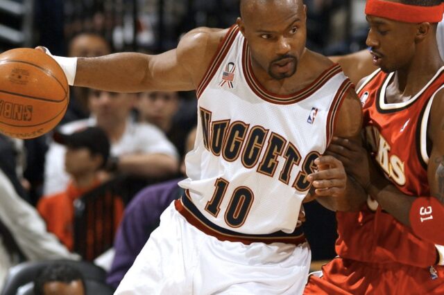
The Denver Nuggets have an announcement this evening that they’ve been building up to for quite a while: a new set of branding for the team, as they try to exorcise the final demons from the Carmelo Anthony era Nuggets. After missing the playoffs the last five seasons, Denver looks to be rebranding with some color changes, logo changes and even font changes. Since we’ve been writing about changing the branding for years here at Denver Stiffs, this is a welcome announcement and much anticipated. While we don’t know everything we’ll see tonight there have been some hints dropped by the Nuggets and others – so let’s examine the trail.
New font
The Nuggets have gone to just this logo on the upper corner of their NBA site, while wiping both the old logo and font from their social media accounts:
This content is no longer available.
That font is identical to the one uncovered by Conrad Burry at Sportslogos.net and discussed here at Stiffs in May. This is his mockup of how the Nuggets name across the front of Denver’s jerseys would look in that font:
This content is no longer available.
Expect to see that tonight, potentially on a jersey since the Nuggets have been advertising the logo and font change all over their Twitter and Facebook accounts and showed a clip of jerseys being hung in lockers yesterday.
New colors – or should I say old colors
Again, the rumor has been a return to the pre-Kiki-Vandeweghe color scheme of darker reds, blues and golds and away from the UCLA light blue and gold that he brought in with Denver’s last rebrand. Again, Sportslogos.net had the scoop:
You can see that they kept the crossed pickaxes in the circular logo but went through some color changes to reflect the expected new scheme. As Zach Mikash said in the Stiffs article on that release:
The hat details confirm a lot of things about where Denver’s branding is headed. First, it appears that they will not be adopting maroon as one of the colors, a la the 1990s, but rather a straight red a la the 1970s (an obviously the Colorado State Flag). However, unlike the classic 70s jerseys, it appears Denver is going with a main color of navy rather than royal blue. Burry also appears to be spot on with his predicted the overall design of the Nuggets new primary logo. Other details to note are the patches on the side. The 67 patch is obviously a reference to when the Nuggets were originally founded, and another patch is the flag for the City of Denver. However the patch at the back appears to be one of the three alternative logos the Nuggets will use this season as Burry mentions. Given the alternative logo features the skyline of the city of Denver it’s not a far stretch to speculate that it will be featured on the Nuggets “City Edition” jersey (which gets re-designed every season).
A closer look at that back patch:
This content is no longer available.
No cartoon mountain or puffy-lettered logo
This one is not a guarantee, but nowhere in any of the leaked items has the cartoon mountain been shown, and the new font is almost certainly replacing the balloon letters of the old main logo. Denver’s going for a cleaner look, and leaving the baggy look of 90s suits behind (except for throwback logos, which I’m sure there will be plenty of).
Playoffs are now guaranteed
This is obviously the most important one: Denver color scheme changes have led to playoff appearances that same year both in 1993-94 and in 2003-04. Nugglife and coincidence do not go together. Everything is the will of the basketball gods and their terms are clear: to cleanse some bad karma the Nuggets will need to sacrifice their old branding for new.
So look forward tonight not only to new colors, new fonts and some pageantry, but also to locking down a playoff appearance this coming year. The season-long celebration begins shortly.
You wouldn’t argue with the basketball gods, would you?