With our Denver Nuggets missing the playoffs for the third consecutive year, I’ve admittedly been in a nostalgic mood for better times in Denver’s pro basketball history. But among the topics I’d like to tackle this off-season will be the franchise’s current marketing and out-reach to basketball fans in Colorado, and to me that conversation begins first and foremost with a new team logo, color scheme and uniforms that connects the past with the present.
Much was made here and elsewhere about the Nuggets finishing dead last in home attendance this past season, which is really a shame because unlike the “Brian Shaw Years” from 2013 through 2015, new Nuggets head coach Michael Malone instilled a great culture in the locker room and the team has some young talent worth rooting for, like Emmanuel Mudiay, Nikola Jokic and Will Barton among others. But unfortunately, whoever is in charge of marketing for the team wasn’t able to make the case that this young Nuggets team is deserving of our in person support. (Of course, it doesn’t help when your team is well below .500 for a third consecutive season and the ticket prices are the 14th highest among all NBA teams … a topic we’ll deal with at another time this off-season.)
The need for a new Nuggets logo and uniform was revisited in my mind when Chris Creamer, founder and proprietor of the terrific site SportsLogos.net, leaked out the new Sacramento Kings logos over the weekend. Creamer noted that the logos are presented in black only as the color scheme hasn't yet been released.
In describing the new Kings logos, Creamer writes:
The logos show a modern take on the logo the Kings took with them to Sacramento from Kansas City in 1985, the logo was originally designed for the Cincinnati Royals in 1971 and moved with the team across the country through Kansas City and Omaha before settling in California in the mid-1980s.
Later in his post, Creamer notes that the Kings’ new logo(s) – like anticipated new logos for both the Utah Jazz and Detroit Pistons for next season – are “modern-retro,” a trend we’ve seen more and more frequently with recent NBA team logo changes. The new Kings logo(s) have already been embraced enthusiastically by our friends and the readers at Sactown Royalty, and I have to agree with their sentiment as I think they’re really cool and a welcome change for that long suffering fan base.
Examples of other recent “modern-retro” logo changes include the Atlanta Hawks going back to their 1980s’ “Pac-Man” Hawk logo, the Golden State Warriors incorporating elements from the Golden Gate Bridge logo that they used in their “The City” logo from 1969-1971 and the Charlotte Hornets revisiting their “Hugo the Hornet” logo with an updated look. Even the Washington Wizards decided to pay homage to their past incarnation as the Washington Bullets when changing their logo in 2014.
Unless we’re talking about a legacy franchise like the Los Angeles Lakers, Boston Celtics, Chicago Bulls or New York Knicks, it’s not uncommon for NBA teams to change logos every decade or so. And even some of those franchises have undergone a logo tweak or two over the last several decades.
Our Nuggets, meanwhile, have essentially used the same logo since the 1993-94 season, making only color changes along the way and one major uniform change to begin the 2003-04 campaign. When the Nuggets changed uniforms and logos for that 1993-94 season, they abandoned 11 years of "the rainbow skyline" logo (also known as the "Tetris logo", which has become much more popular since being replaced than it ever was while being used) and two decades with the round-ish, "Soul Train"-ish font that was synonymous with the Nuggets since the franchise was renamed the "Nuggets" in 1974. The new logo, created for the 1993-94 season, was similar to others of its era in the NBA with cartoon-ish bold lettering. And the new color scheme of dark navy blue / maroon / metallic gold was a big departure from the Nuggets history of using royal blue, yellow gold and a touch of red in its uniform and logo scheme going back to the mid-1970s.
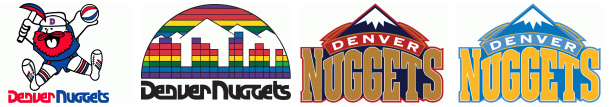
Nuggets logos over the years, from 1974 through the present.
When Kiki Vandeweghe took over the Nuggets as team president in the early 2000s and drafted Syracuse star Carmelo Anthony in 2003, he and the franchise felt that a re-boot of the team’s uniform and color scheme was called for. And with Vandeweghe being a UCLA alum, the Nuggets unsurprisingly donned UCLA’s powder blue and yellow gold color scheme … while leaving the bold, cartoon-ish logo as-is. I didn’t like the powder blue and gold uniforms and logo then and I still don’t like them now. As my Uncle Marty – aka the Nuggets Curmudgeon – likes to repeatedly point out: Who in pro sports wins championships while wearing powder blue? His point being, the Nuggets look weak when facing the black-clad San Antonio Spurs and Portland Trail Blazers, or the red-clad Los Angeles Clippers and Houston Rockets, or the dark blue-clad Warriors and Minnesota Timberwolves, and so on.
And I'm not the only one who's not in love with the Nuggets adopted UCLA color scheme. Just attend a Nuggets game at Pepsi Center and compare the amount of fans who wear powder blue and gold gear versus fans rocking rainbow skyline or Maxie Miner (the Nuggets logo from 1974 through 1981) apparel. I for one own nothing in powder blue but have ample amounts of gear featuring both Maxie Miner and the skyline.
To the Nuggets credit, they tried to bring back the rainbow skyline and 1970s/1980s Nuggets font with their alternate yellow gold uniforms, and they've tweaked the powder blue and gold by adding in dark blue lettering and numbering this past season. But it's long past time for the Nuggets to seriously consider a new logo and uniform for the long term and join their NBA brethren with their own modern-retro look by incorporating the skyline and/or their original font. Not only would such a change potentially inspire old school Nuggets fans to get re-engaged, but it would get the tens of thousands of millennial NBA fans moving to Denver in droves – who have a fondness for anything retro – excited about being Nuggets fans.
As my colleague Adam Mares pointed out to me, the NBA is changing uniform providers from Adidas to Nike to begin with the 2017-18 season, so the timing couldn't better for the Nuggets to get a new logo and uniform two years from now. Moreover, that will be the season that the Nuggets probably return to the playoffs for the first time in four years. And, coincidentally, the Nuggets have a nice history of returning to the playoffs after absences during seasons in which their logos and/or uniforms change. For example, when the Nuggets introduced the "rainbow skyline" logo and uniform to begin the 1981-82 season, they returned to the playoffs at the end of the season after a two-year absence. And the same thing happened with the 1993-94 and 2003-04 campaigns.
Having not undergone a logo change in over two decades and having not undergone a true uniform change for over 10 years, the Nuggets are long overdue for a new look. Just like they're about to be long overdue for returning to the playoffs.
This content is no longer available.