Conrad Burry, aka uniform super sleuth, of sportslogos.net has the details again on the latest tidbit of info to come out about the Denver Nuggets rumored branding re-design. The latest detail to be leaked is the Nuggets draft night hat.
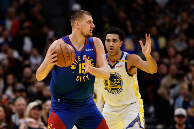
The hat details confirm a lot of things about where Denver’s branding is headed. First, oit appears that they will not be adopting maroon as one of the colors, a la the 1990s, but rather a straight red a la the 1970s (an obviously the Colorado State Flag). However, unlike the classic 70s jerseys, it appears Denver is going with a main color of navy rather than royal blue. Burry also appears to be spot on with his predicted the overall design of the Nuggets new primary logo. Other details to note are the patches on the side. The 67 patch is obviously a reference to when the Nuggets were originally founded, and another patch is the flag for the City of Denver. However the patch at the back appears to be one of the three alternative logos the Nuggets will use this season as Burry Mentions. Given the alternative logo features the skyline of the city of Denver it’s not a far stretch to speculate that it will be featured on the Nuggets “City Edition” jersey (which gets re-designed every season).
Personally, I’m excited about this leak. The navy/red/yellow color scheme is a new twist on some classic Nuggets brands and the new primary logo is a huge improvement. I’m not as sold on the alternative logo but the skyline looks to be a more royal blue so perhaps keeping with the new twists on old classics theme this alternative logo will be used on a jersey that looks like a spin off of the classic skylines. What do you think Nuggets Nation? Are you on board with this new color scheme?


