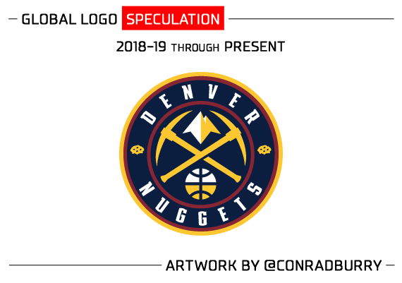
Conrad Burry, a graphic designer and an enthusiastic investigator of NBA uniform and logo changes, just posted this update on a potential font change for the Denver Nuggets:
This link takes you to the larger post so you can get a better look at both the new typeface Denver may be utilizing next season as well as some mockups done by Burry himself. First, here is the typeface he found and colored himself to give a better representation of what Nuggets fans might expect going forward.
This content is no longer available.
This would seem to indicate that Denver’s cartoon-style font which has been a fixture since the 1993-94 season will become a throwback style rather than part of the brand going forward. It’s also a change from the more recent lettering featured on Denver’s jerseys in the last couple of seasons:
This content is no longer available.
The points on top of the letters are more squared off in the newly-trademarked version and the curves on the U, G and S are far more shallow. Burry also has mock-ups of the potential new round logo with this updated lettering, and far more information on what he is hearing the Nuggets will do for their next color change and secondary logos as well (which includes a return to the pre-Kiki-Vandeweghe color scheme of darker reds, blues and golds.
Again, please check out Burry’s site for all the details at Sportslogos.net and then return here to let us know what you think!
This content is no longer available.

